
Price Action Fundamentals and Momentum Exploration
- Home / Non Member Articles (Free) / Price Action Fundamentals and Momentum Exploration
This is a guest article form another price action trader. Thanks to Big Swiss for his contributions.
This series of articles explores the foundations of Price Action and why it works. I also wanted to provide a framework for others to begin to understand and explore these aspects without having to be an expert. With everything that is presented, I welcome you to consider what is written, review historical charts and live examples, and see if you arrive to the same conclusions (I believe you will). In short, do not take these aspects as absolute truth (as there are few things that are). However, if they result in you taking a fresh perspective and approach in attempting to understand the language, you may find yourself releasing incorrect presuppositions and obtaining a fresh view. Some things may appear very obvious to you. Wonderful! Keep exploring those aspects as you can continue to build on your strengths. Other things you may find are a bit perplexing. Hopefully some of these conversations can assist you in exploring those aspect further until you have a stronger sense. Where is the best place to find those answers? The market of course!!!
Setting the Table
First, Price Action is founded using three critical aspects: momentum, support, and resistance. Note, for every buyer there is a seller. This is so important that I’m going to repeat it in all capitals – FOR EVERY BUYER THERE IS A SELLER! Since the ES is an institutional market where the majority of the participants are institutions (large volume and resources), and the institutions trade using an edge, that means that each side believes that statistically they are making a logical, voluntary action. You are not going to “fool them”. They are not after your money, and they are not targeting your stops. However, this concept yields a critical key to assist in training. If each participant is voluntarily taking an action to which they see benefit, then the resultant price movements within historical charts show exactly where support and resistance areas exist. If price stops moving upwards, it is because buyers are insufficient in strength at a specific price to result in absorbing all of the selling at a price level. The reverse also holds. The most important implication from this is that it enables you to review historical charts and see where buying and selling pressure existed (support and resistance) logically. This type of studying will familiarize you with how markets move over different periods of volatility (high and low), as well as transitions between a variety of market cycles (trend, trading range, breakouts, extremes . . . ).
Price Bars, Momentum and Exploration
Each bar on a chart represents a price movement within a certain structure. For time charts, the x axis is time. For tick charts, it is number of trades. Then, with the assumption that all price movement is logically based, a bar that begins on its low, and ends on its high is showing a positive bias in an upwards direction. If the bar is a very large bar, then the people who were buying throughout the bar period were much stronger than the sellers for that period. If the bull bar “closes on its high”, then the momentum is slightly stronger to continue in the same direction. Why? Because for that brief period of time the institutions buying at that price agreed that the price gave them an advantage (as many people may only trade long this allows for the justification). It would not have occurred otherwise because if there was not a buyer at that price, and there were sellers in the market, the price would have ticked down to find a buyer, which would have been at a lower price. The implication is that a bar that does
not close on its high or low is not as strong directionally. This is generally true and let’s explore this. Note, this also emphasizes why using good signal bars in trading can make all of the difference towards your bottom line because generally, at least for a brief period of time, there is a higher probability of the next tick to increment in the same direction.
Exploration of Bars Closing on High or Low To Show Momentum
This investigation is not a trading system, and many of the techniques within PATS assist in refining trading to only very high probability trades. However, this exploration, as well as reviewing other charts for confirmation, may begin to show where trading biases can be uncovered.
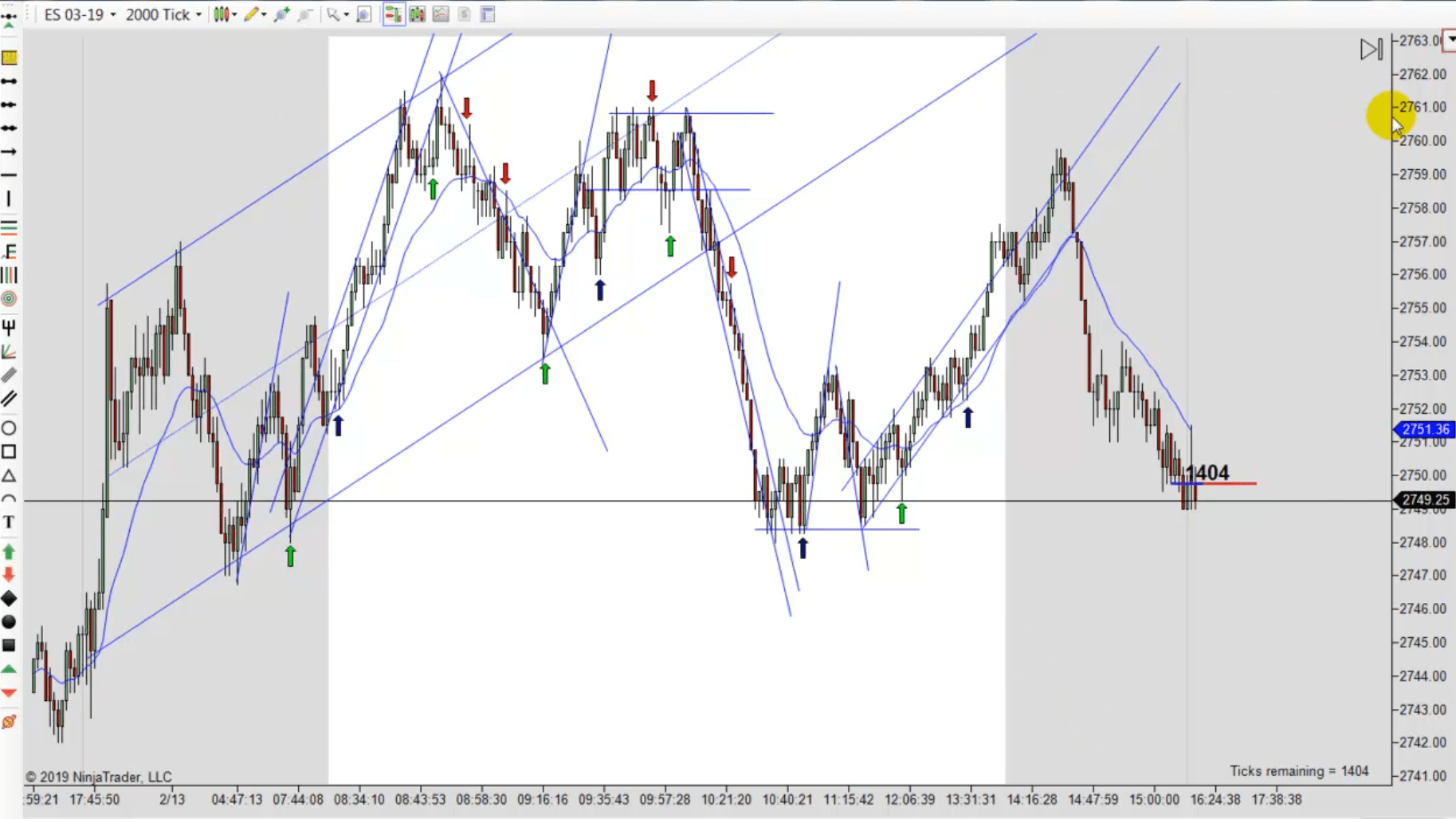
In the enclosed graphic, I have marked bars which closed on their high or low. I have marked the charts slightly differently but the simple marking should be obvious. Please work through each bar, beginning from the left (as if one was trading), and ask the following questions:
1) If a stop was created above a swing high or low, and one entered on that bar, would it have been profitable for a scalp (marked with a “w” for win and “*” for loss)?
2) Did that bar begin at a swing high or low?
3) How often did the bar after the entry bar close in the same direction? Why do think that is?
4) If a trade was not profitable, why do you think that may be?
Count w=31 Count *=12
This is a chart that many believe would be impossible to trade. What are your current thoughts? Please review the PATS graphic too. While there are stronger rules for PATS entry areas (and we will explore more in potential future articles), see if you can anticipate some of the momentum using similar questions and insights.
Big Swiss


This site uses Akismet to reduce spam. Learn how your comment data is processed.
Comments
beo June 15, 2020 at
Great article ! Mack could you make your chart images clickable please ? It will be a lot easier to have a link to the full size picture.
CURLY June 19, 2020 at
CTRL + will work on windows. Or do what I do for screen shots https://www.faststone.org/FSCaptureDetail.htm. You can easily resize and mark it up then.
beo June 23, 2020 at
Good workaround but access to original image is better imho, like this :
https://priceactiontradingsystem.com/wordpress/wp-content/uploads/2020/06/ES-03-19-2000-Tick-2_13_2019-MOMENTUM-EXPLORATION-v1.jpg
EnveousColnago June 15, 2020 at
Does anybody have a link to this guy’s site where we can read more from him?
Mack June 18, 2020 at
I do not believe he has a website, but he will be sending more articles that I will post here.
Dan June 15, 2020 at
I’m assuming by “scalp” he didn’t mean the typical 4 ticks that we use with Mack’s system. Good article. Thought provoking.
Guy Napier July 9, 2020 at
This is one of the most thoughtful visual analyses I’ve seen. Until this chart, I never realized how important moment-to-moment momentum is in day trading. Bringing this insight into Mack’s PATs is a big win for everyone and their trading account balances. I look forward to more of your thoughtful analysis. Thanks, Big Swiss.
Guy Napier July 9, 2020 at
Big Swiss and Mack — I just wanted to follow up with my results today on trading the buy the “closes on its high” and sell the “closes on its low” investigation/system. I tried to take as many as I could during the 4 or so hours I am trading. Today would have been the best PATS day ever for me if I could have kept up — just too much — and it was a fantastic day anyway. My count shows the number of a net positive trades to be 27. Anything above 10 makes the day a home run, and about every day I have checked so far achieves that. At one point, there were 4 of 5 losers, but also 10 winners in a row at another time. I am sure the system can be refined with all the insights Mack urges around avoiding congestion and using support/resistance. But there are some great insights and discoveries in Big Swiss’s work. I am surprised someone has not commented on it yet! But thanks some much for all the great work you both do!
mgriego10 November 26, 2020 at
I believe this exercise will help me to think about what the others (buyers/sellers) are doing in regards to any given candle. Right? When I read question #1, “If a stop was created..” I am thinking about stops created by other buyers or seller. Is that correct? And if I entered on that bar would it have been profitable for a win or loss. I can see why it was profitable or not, but I want to think of it in terms of what the other traders are doing. Does that make sense?
For example, take the very first example.
There is a downtrend, so we are watching the sellers, there’s a first leg, then second leg and there’s a bullish doji. Rather than take that long trade at the bullish doji, we are thinking about what the sellers are doing because it was in a downtrend. At the doji, they’d do nothing, at the next doji bullish candle, they do nothing but then when they see the bearish candle, they go short, set their stop one tick above and our signal to enter is that the second the following candle dropped below the bearish candle and moved upward, there was the possibility of it being an engulfing candle so we set our entry at their stop, which is one tick above the bearish candle.
Is that how I should be thinking of my trades?
Soxphan February 23, 2021 at
Thank you for the article Mack and Big Swiss. Great insight. I’ve noticed the same information while studying my charts in the evenings, and I’ve been trying to formulate a strategy to capitalize on this information. Obviously, one wouldn’t take all of the trades marked above due to the context surrounding the entry candle. Has anyone been successful in a strategy to trade these instances that seem abundant daily? Thank you!